
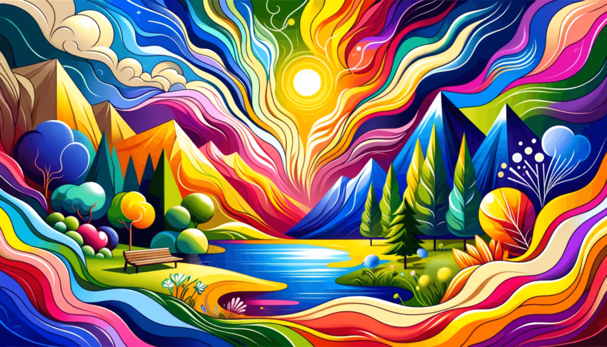
The Palette of Perception
Have you ever wondered why certain brands immediately catch your eye, or why some products feel just ‘right’? It’s not just about the shape or the slogan; it’s the colors. Yes, the colors! They speak a language of their own, whispering (or sometimes shouting) messages that we perceive, often without even realising it.
Take a stroll down memory lane and think about the brands that have stayed with you. You’ll likely find a rainbow of carefully chosen hues, each telling its own story. This isn’t a coincidence. It’s a well-orchestrated symphony of colour psychology in branding and design.
A Symphony of Hues
Imagine walking into a room painted in soft blues and greens. Your shoulders relax, your breathing slows, and a sense of calm envelops you. Now, replace those colors with bright reds and oranges. Feel the energy change? That’s color psychology at play, and it’s a powerful tool in a designer’s kit.
In branding, colours aren’t just aesthetic choices; they’re strategic decisions. Each hue evokes specific emotions and associations. For instance, blue often conveys trust and reliability (think of those banking and tech giants), while green is the go-to colour for brands wishing to project an eco-friendly or natural image.
The Cultural Kaleidoscope
But here’s a fascinating twist: color meanings aren’t universal. They change with cultures and contexts. The color red, for example, can mean luck and prosperity in some Eastern cultures, while it might signal danger or urgency in the West. This cultural kaleidoscope makes the use of color in branding a delicate dance of global understanding and local sensitivity.
Crafting Emotions with Color
So, how do brands use this knowledge? They craft an emotional experience. When you see a certain shade of yellow, you might feel happy and energized, thanks to a certain fast-food giant. Or a particular purple might make you think of luxury and exclusivity, courtesy of some high-end brands.
This emotional crafting extends beyond logos and packaging. It’s in website design, product design, and even in the lighting of physical stores. It’s all about creating an atmosphere that aligns with the brand’s identity and values.
Beyond the Rainbow – The Future of Color in Branding
As we look to the future, colour psychology in branding and design is only set to deepen. With advances in technology and a growing understanding of human psychology, brands will continue to fine-tune their colour strategies. Perhaps we’ll see personalized colour experiences, with brands using data to tailor their colour schemes to individual preferences and cultural backgrounds.
In a world where attention is the new currency, and where consumers are bombarded with information, color remains a powerful, silent communicator. It’s the unsung hero of branding, working its magic quietly but effectively.
So, the next time you find yourself drawn to a product or a brand, take a moment to ask: Is it the colour speaking to me? Chances are, it’s whispering louder than you think.